
Planning and Progress
When I joined Where You At, two Design Systems had been created by different designers for the mobile app and API interface. One of my key duties was to mesh them over time to increase consistency.
Due to the rapid nature of UX progress on the product suite, I had to balance expanding the Design System according to feature requirements.
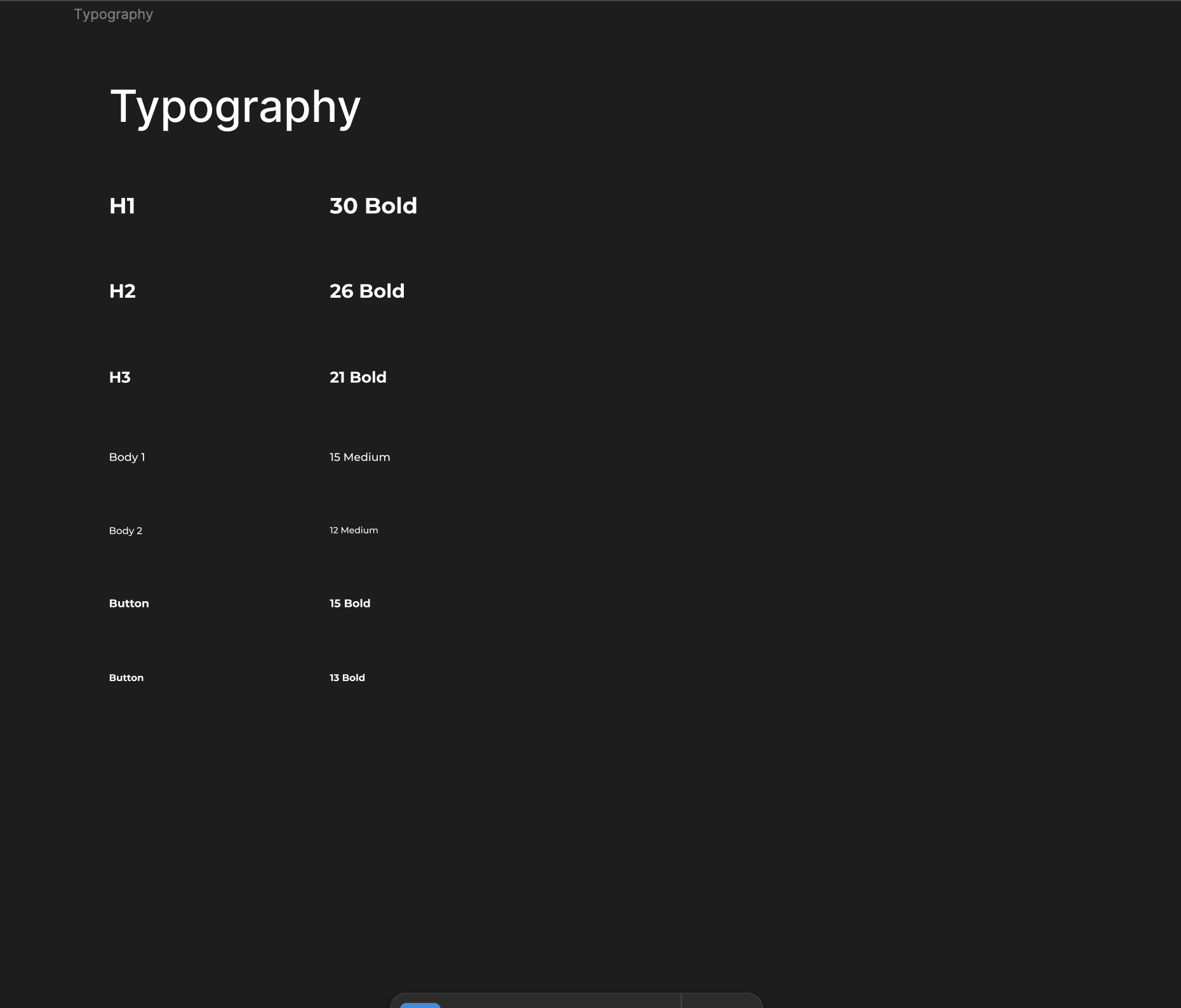
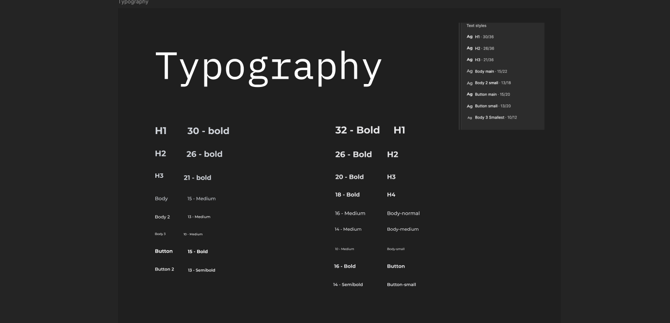
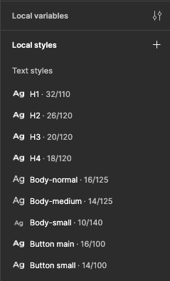
Style Guides


Scope
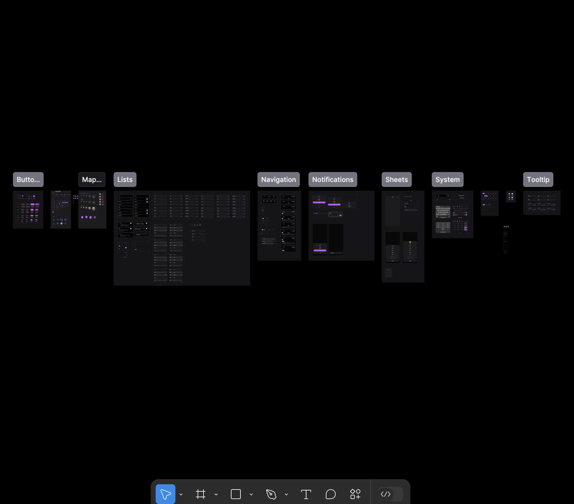
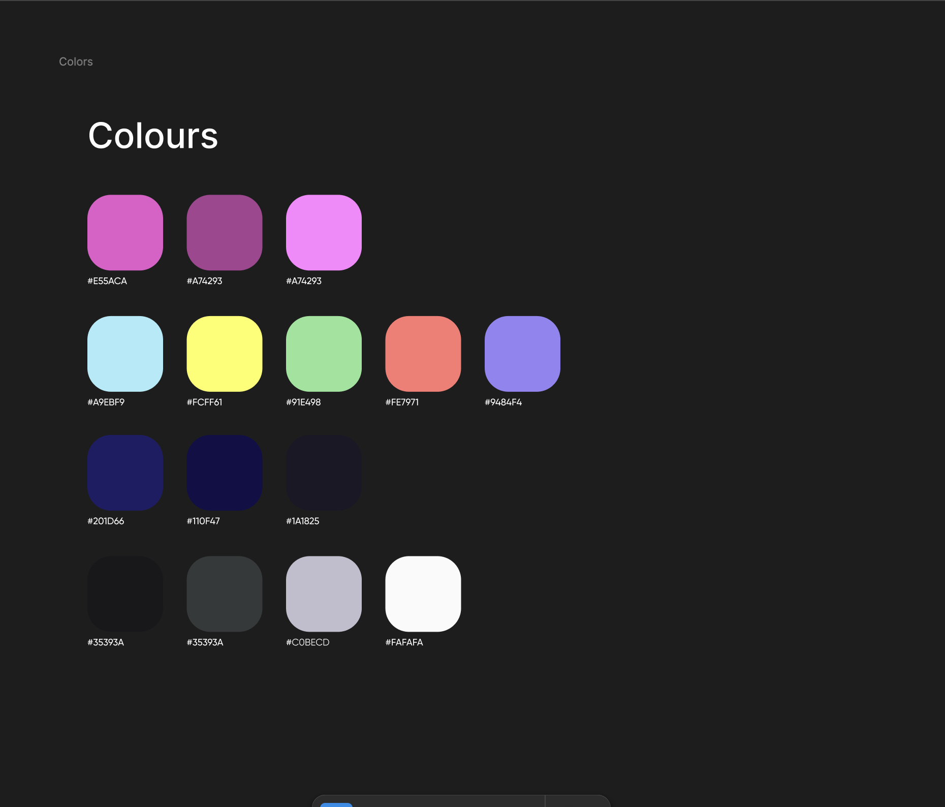
The System needed to be planned with a large-scale scope in mind. The issue was that we had to conjoin two separate systems together.
We focused on switching out some colours so that the palettes got some cohesiveness. But progress was slow because of work requirements.

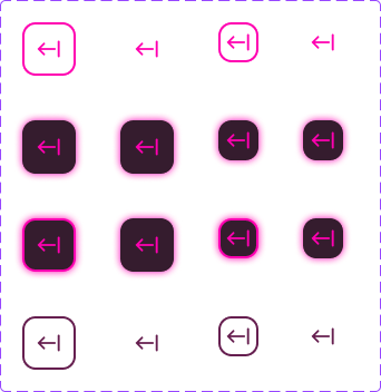

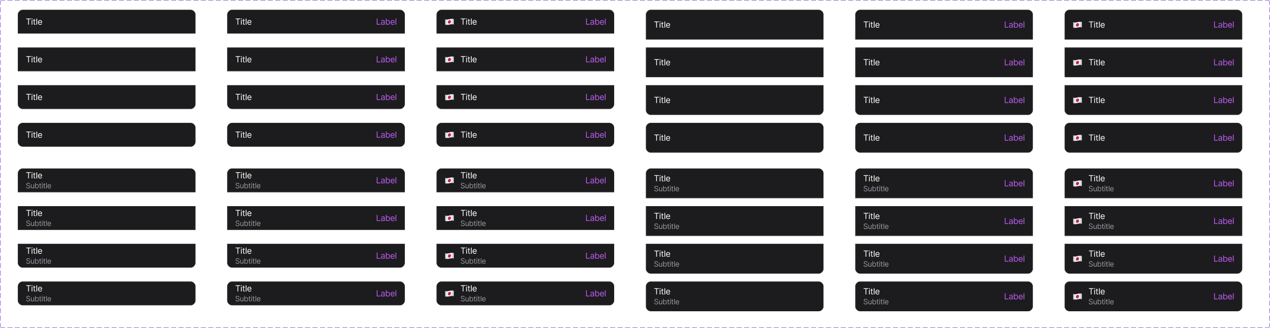
Design System Principles
Disconcerting as it was to work on the Design “FrankenSystem”, the product team made it work to our strengths and prioritised certain strengths moving forward.
-
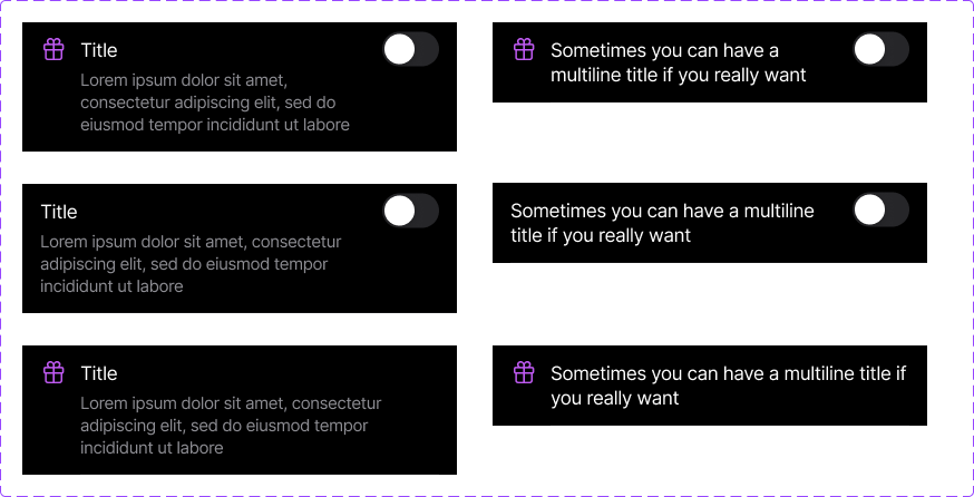
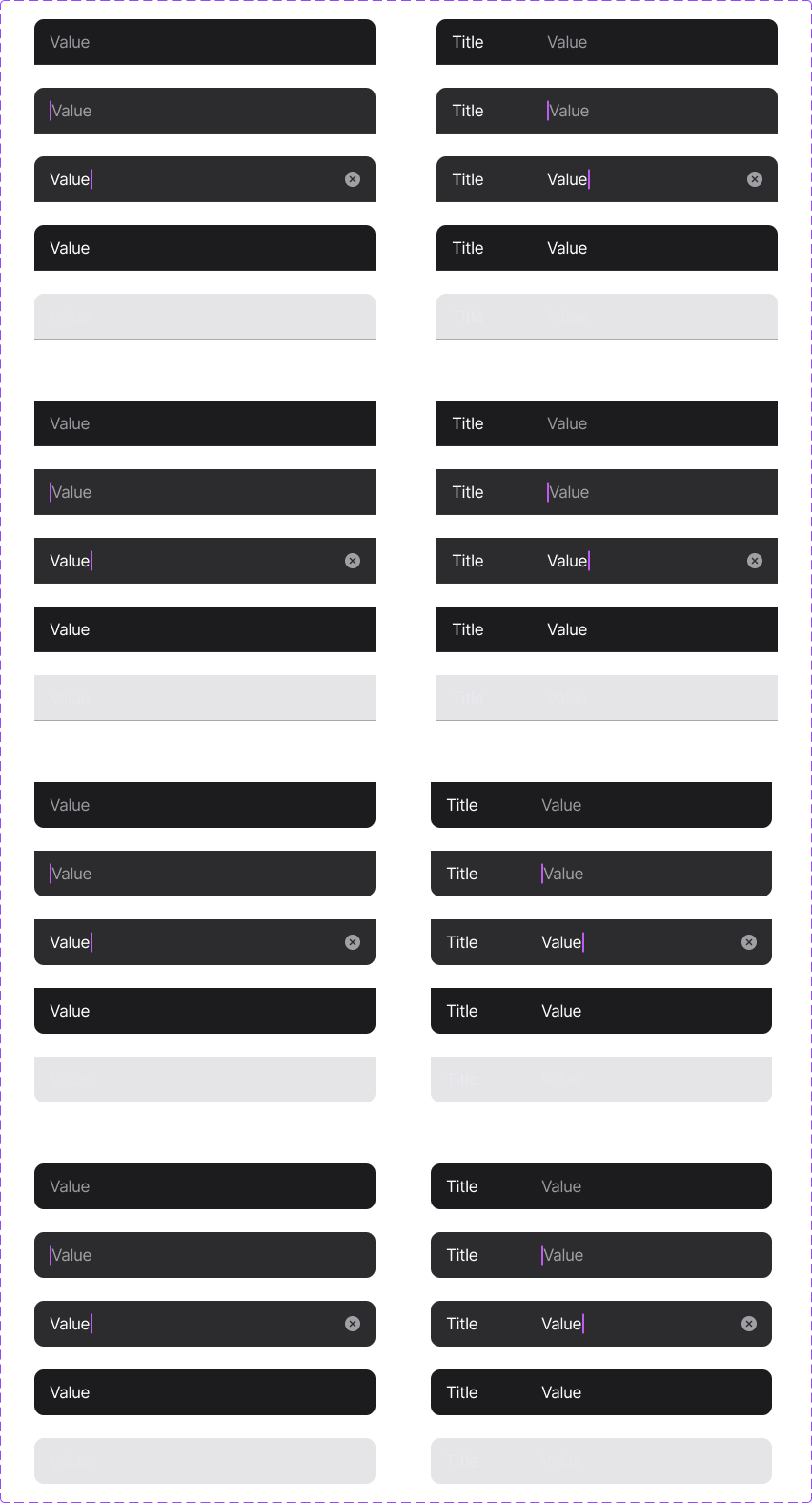
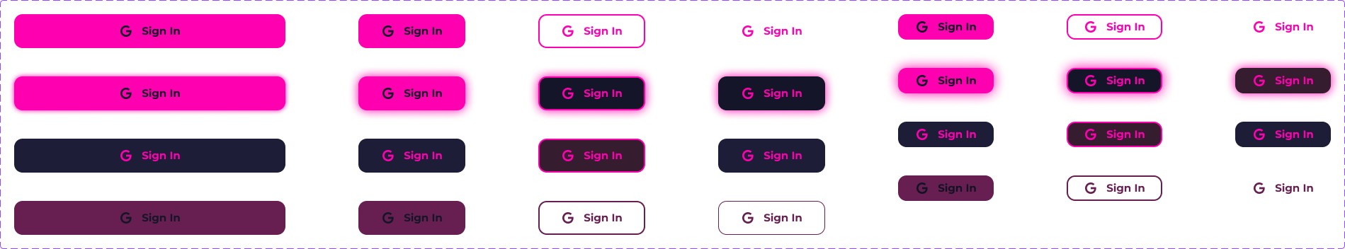
We needed the interface components to be easily visible, since the environment inside clubs is raucous and not suited to app usage.
-
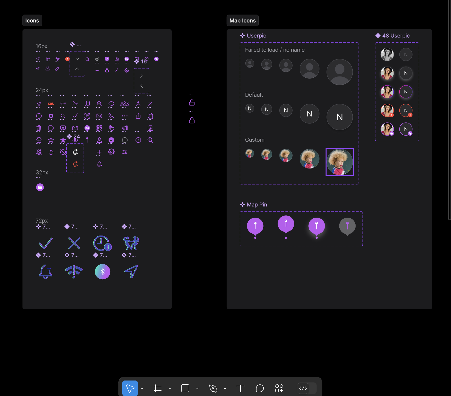
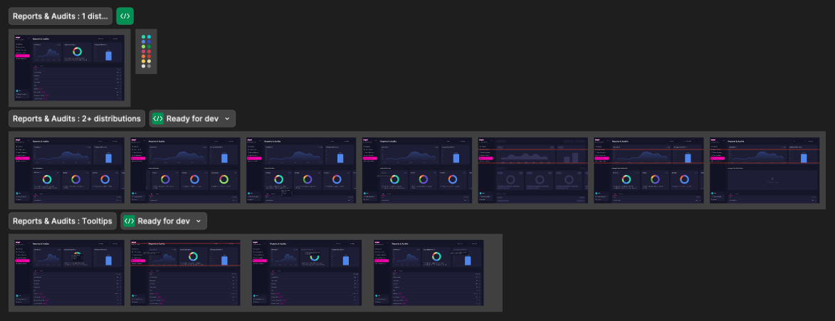
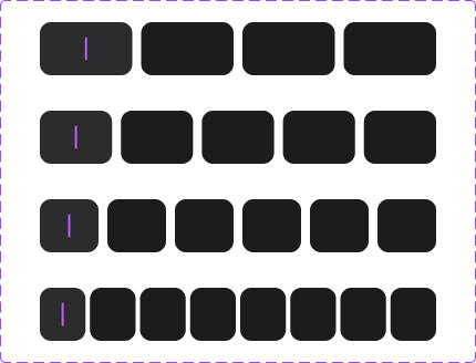
Not afraid to make instances. Necessity when solo designers have to create and design at scale in rapid work flows.
-
How does a design system make sense to a developer? A manager? Our product team was onboarded and equipped to refer to the system if necessary.

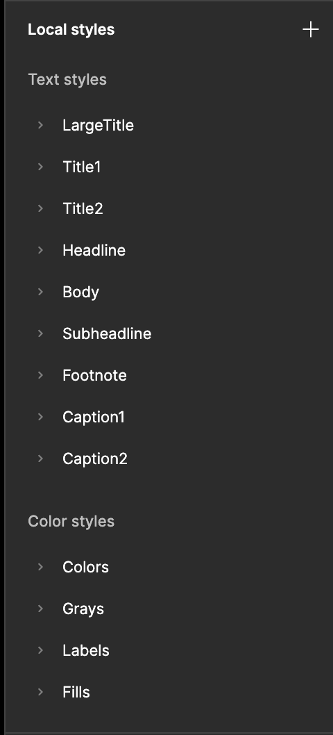
We hardcoded components in CSS snippets in the Figma file itself to reduce developer load, considered accessibility, and set up a prioritised system that dictated when a new component needed to be created as opposed to a specific instance.
What’s Next?
The biggest hurdle would be my main bone with the current scenario: creating one main system that would let users know that the products are actually from one suite.