
iOS Mobile Application
I designed features such as event scheduling, wayfinding, multi-floor displays, profiles, and notifications.
The mobile application is meant to be the primary user-facing interface for all functionalities.
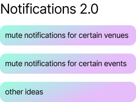
Notification Centre
After conducting an initial UX audit, the most glaring omission in the application was the lack of a real-time user flow through which the user could access their urgent notifications and messages.
It was essential to the primary product mission, and the product team agreed that we needed to prioritise that focus.
I pepper my designs with small notations to help the dev team and mitigate communication gaps.
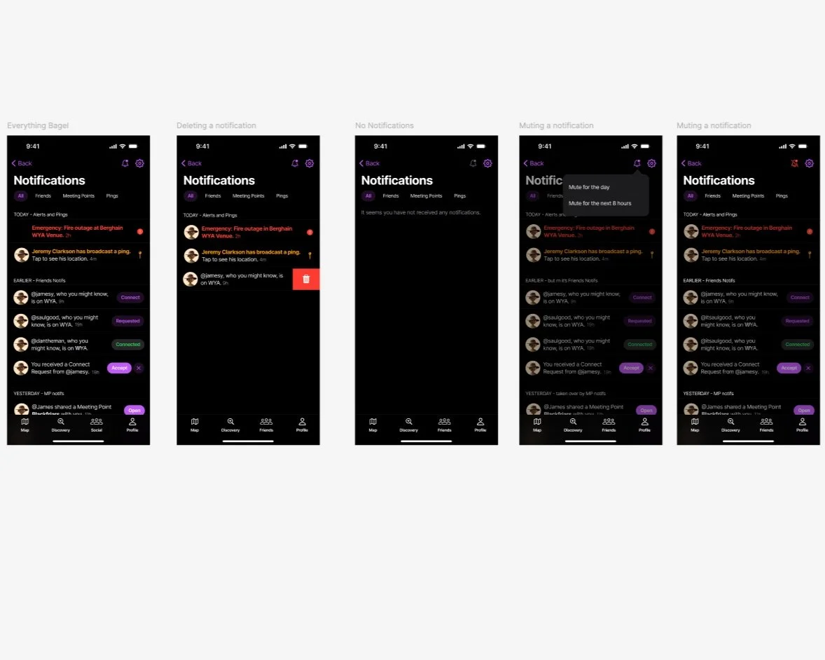
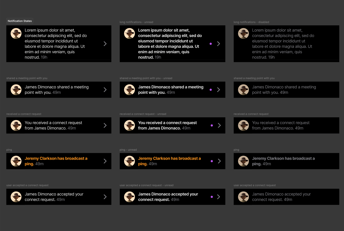

A big collection of the different types of notifications. Our target audience lives and breathes Instagram, and I decided to mimic their notifications to facilitate recognition rather than recall.
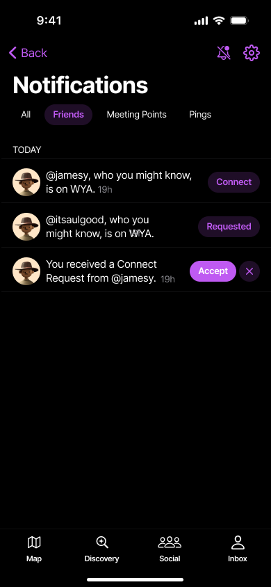
Since WYA is a social media app as well as a safety app, the product team added friend notifications in the MVP version as well. Without friends, the app wouldn't function half as well.
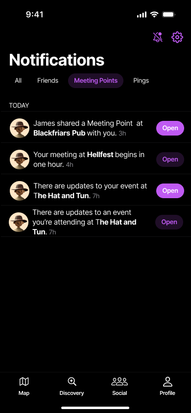
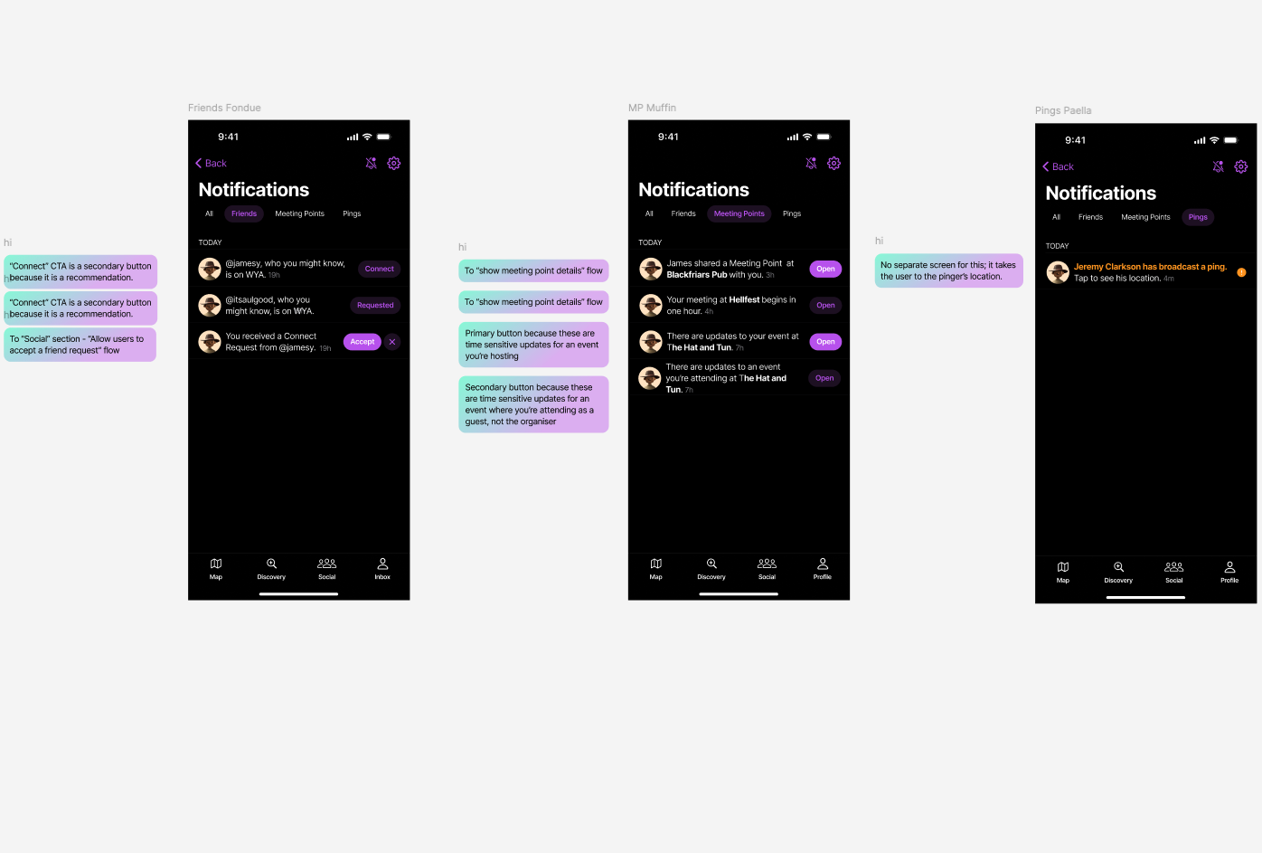
Meeting Points are a feature that allow users to set actionable times and places where friends could meet i.e. washrooms, smoking areas, club bars, etc.
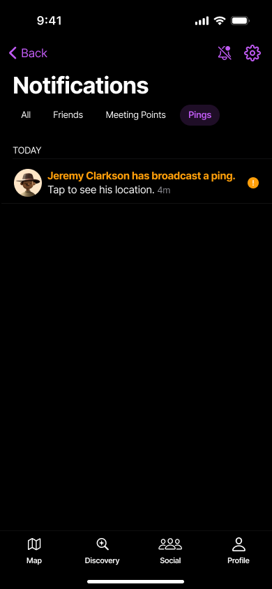
Pings are a feature that would allow users in duress to broadcast their location to both venue managers and their friends. The urgent nature of the notification meant the notification needed to be bold.
What’s Next?
Every good MVP has a follow-up because if not, is the feature just very basic or does it not work?
I conducted some design workshops - Crazy 8s, Divergent Thinking - to come up with some ideas.
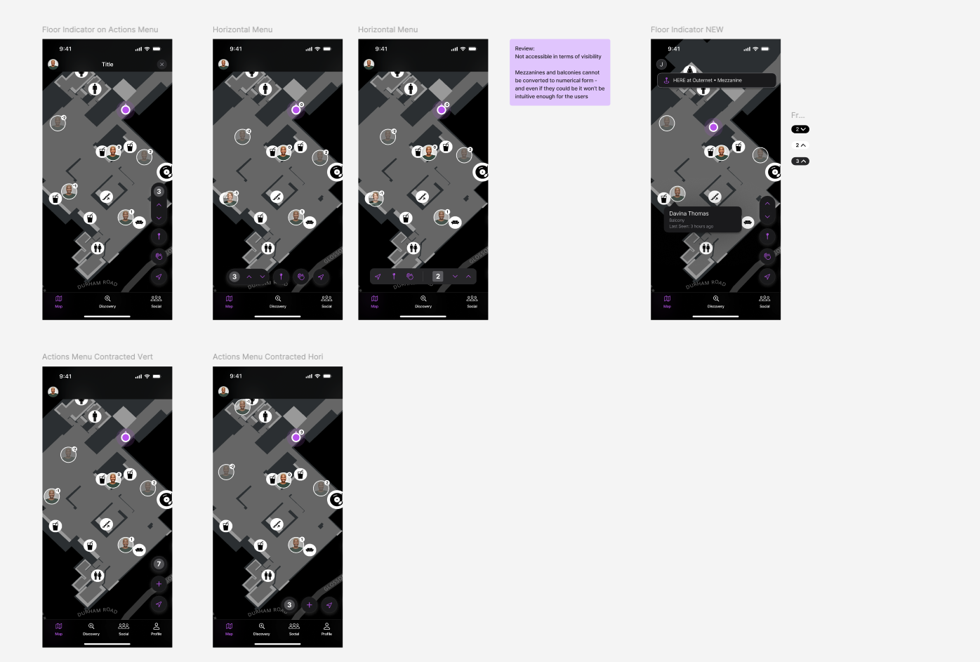
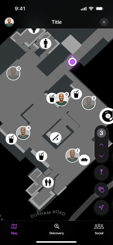
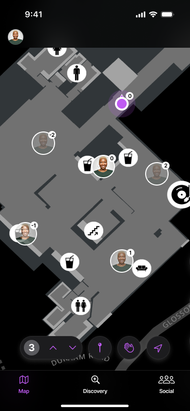
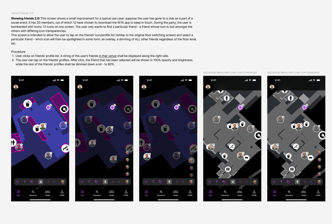
Multi-Floor Venue Display
User Research gave the product team a valuable insight - users could not tell which floors were relevant - finding friends, and indeed, any markers was tough.
I prioritised this bug because I felt that club goers would not appreciate the unnecessary confusion and it’d be (a) poor UX.
The workshop was also created with an aim of fostering better work styles with the product team and keeping everyone up to date with the design process.
The workshop consisted of 12 people besides myself. 7 attendees were from Where You At, while the rest belonged to our target audience demo.
Co-design Workshop: I conducted a workshop to prototype icon placements with visual options.
Floor Indicator Prototypes
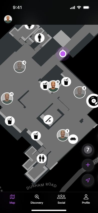
Floor indicators on user icons were ideated to minimise cognitive overload on small screens.

What People Said About The Friend Indicator Icons
“Too much happening. Is my friend 20 feet away or not?”
— Beta User
“The mind won’t obsess over what it won’t see. Why show far friends?”
— Friday Afternoon In-House Discussions
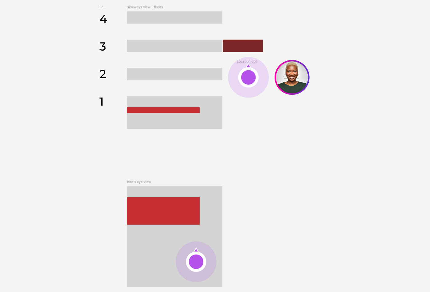
Transparency
I decided to take away irrelevant visual details - and that meant reducing visual impact for friend icons on floors that were farther away - icons that would require the user quite some time to reach.
Friends on the same floor as the user are at 100% opacity
Friends within a floor of the user are at 60% opacity
Friends two or more floors away are at 20% opacity
I bracketed transparency for the “far” friends.
This created an “Opacity Grade” which let (beta) users know which friends were close by.
Very Relevant
Maybe Relevant
Not Relevant
“Why can’t I change and see other floors?”
— Beta Users (4 out of 9 users asked for this feature)
User Control
Manually changing floors on the screen needed interface controls, something we wished to avoid.
The designs for the floor change feature were based off elevator designs, with the current floor view and “up” and “down” controls.

Visual Showcase

What’s Next for Venue Displays?
As it turns out, users would rather directly find certain friends than go hunting for them.
The important bit was to make sure users could navigate to particular friends in the venue.
Meeting Points Coming Soon
Meeting Points Coming Soon

Featuring inter-user communication, adding meeting points, scheduling meeting points, accepting and declining requests, etc. Stay tuned!